Sunset dispatch / AI images & creative perspective
Curiosity looks
good on you.
An independent editorial guide to AI image services, visual taste and the details behind a compelling first impression.
Open the field guide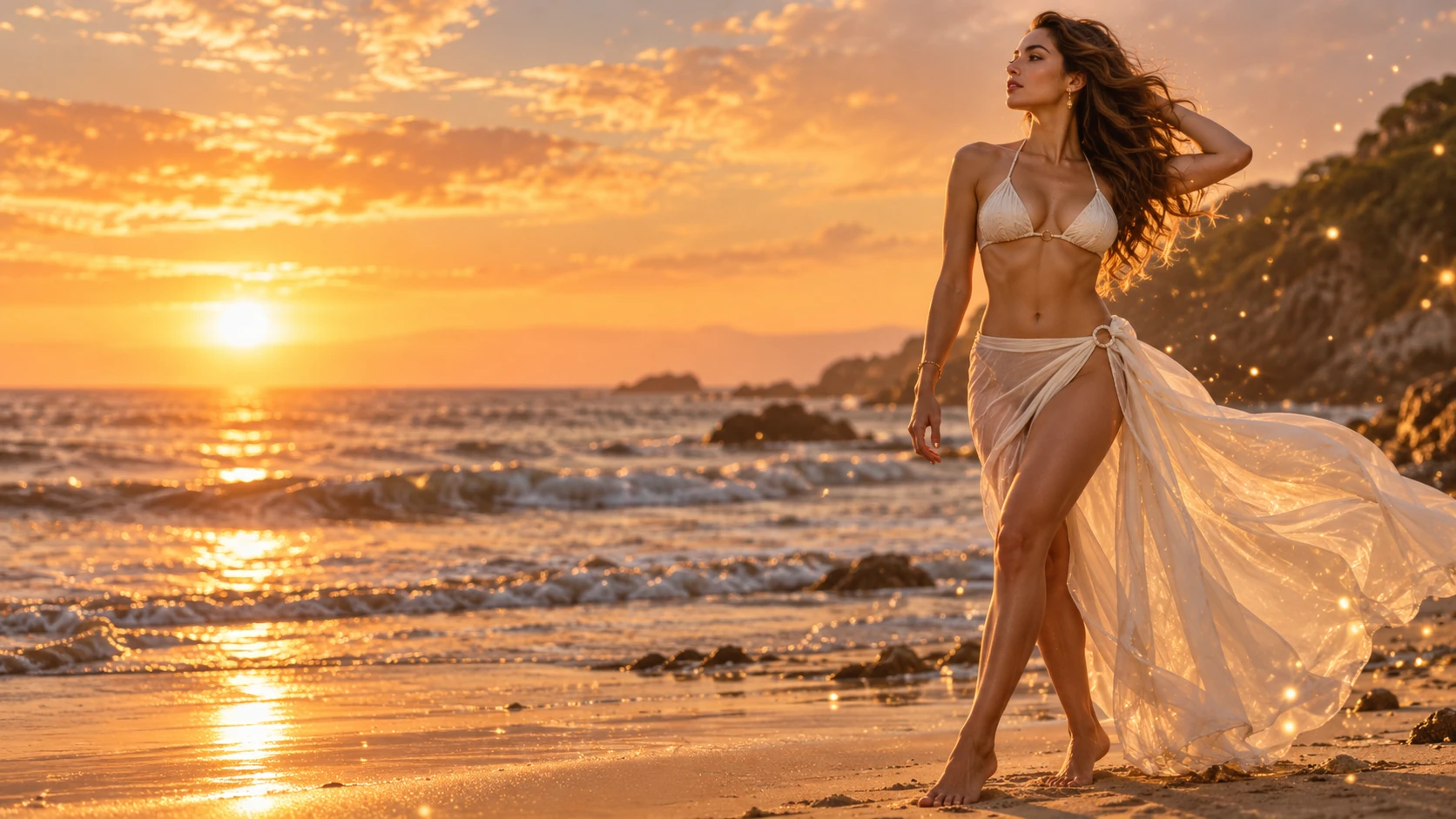
A clearer view of the image.
A beautiful picture can make an entrance before its explanation arrives. The colour feels right, the setting has a little drama, and suddenly a service looks more convincing. Enjoy that first impression. Then give the image a second kind of attention: what does it actually tell you about the tool, the brief or the person making the claim?
Shogun / Edit explores that space between attraction and understanding. Our subject is the way AI image services are presented and evaluated. We are a publication, not an image processor. This edition offers a practical reading framework rather than a ranking or a hands-on product test.
What should I notice first?
Reader question
A useful starting point
Notice the intention. A fictional editorial portrait is allowed to suggest a mood. A photograph presented as a record of a real person or product makes a different promise. If you cannot tell which promise is being made, comparing sharpness or realism will not resolve the more basic uncertainty.
After that, ask how much context the example includes. A single selected picture shows what was chosen for display. It does not reveal the unseen attempts, the finishing work or the conditions behind the selection. You can still appreciate it; just keep appreciation separate from evidence about ordinary results.
Same curiosity. Different questions.
Perspective / one scene at a time
The atmosphere
Warm window light, reflected water and an evening sky all contribute to an image's feeling. In a creative brief, those details can be the point. Describe the relationship you want between subject and setting before judging whether a result feels successful. An atmospheric picture is not automatically a faithful one, and fidelity may not be the main goal of a fictional scene.
The expectation
Imagine a different brief: a straightforward portrait for a professional introduction. The visual priorities might include an uncomplicated background, a recognisable expression and a crop that works at a small size. A cinematic treatment could become distracting even if it looks impressive in isolation.
These are hypothetical briefs, not tests performed with a named provider. Their purpose is to show why a useful comparison needs a defined task. Choosing a tool without that task is a little like choosing an outfit without knowing the occasion: the result can be beautiful and still miss the room.
Make room for a better question.
Before the comparison / a creative brief in three moves
Choose a few words that describe the intended feeling: unhurried, playful, direct or theatrical. Then connect them to visible decisions such as framing and setting. “Confident” might mean clear eye contact in one brief and a distant, expansive composition in another. The adjective becomes useful when you explain what you mean by it.
Decide what cannot drift. It might be a product's proportions, the relationship between objects or a particular visual hierarchy. Make that priority explicit before comparing attractive examples. Otherwise, the image with the strongest immediate mood can quietly win a contest that was supposed to be about a different requirement.
Finish with one question that the available material does not settle. Perhaps you need to understand an editing control, an export condition or how an example was selected. Keeping the question specific makes your next reading purposeful. It also prevents a promising first impression from becoming a conclusion you have not actually earned.
Give every claim the right question.
The comparison desk
A framework for reading a service description. No scores, invented winners or implied laboratory results.
| Look at | Ask about | Keep distinct |
|---|---|---|
| Creative fit | Which part of the brief is the service intended to address? | Aesthetic preference and practical suitability |
| Example selection | How much is known about the conditions behind the showcase? | A selected demonstration and typical performance |
| Control | What changes can a reader actually verify from current documentation? | A feature name and a demonstrated capability |
| Information | What is stated about image handling, permitted use and limitations? | A provider's policy and independently checked practice |
Use equivalent questions across services. Otherwise, a detailed description from one provider can appear stronger than a sparse description from another even when you have not compared their actual behaviour. Missing information belongs in the comparison as a gap, not as a favourable assumption.
Presentation can also change what attracts your attention. A large image beside a confident headline may feel more persuasive than a modest description, even when the underlying information is similar. Read the claims away from their visual setting once. Then return to the page and decide which part of your response came from the explanation and which came from the atmosphere.
Keep your own priorities visible as well. Someone exploring a fictional visual style and someone preparing a faithful product record do not need identical answers. A comparison becomes more helpful when it explains whom its criteria serve and what it leaves outside the frame.
The image service field guide.

Editorial feature / deeper reading
Not sure where to begin? The field guide turns a broad interest in AI imagery into a clear reading sequence: define a creative aim, inspect the examples, distinguish controls from outcomes, and record the questions still waiting for an answer.
It includes a short comparison worksheet and an example of how an apparently strong image can be a poor match for a different task. Read it as a companion to this dispatch, rather than as a recommendation to buy or subscribe.
A familiar name still needs context.
Service context / commercial reference
Visit ClothoffOne name readers may encounter in this category is Clothoff. The link is a commercial reference. This edition does not establish its current capabilities, prices, privacy practices or suitability, and it does not present a performance verdict.
Read any provider's current information on its own terms. Do not transfer a claim from another service or infer a capability from an unrelated editorial image. The illustrations on this site depict fictional adult characters and come from a supplied archive; they are not results obtained by this publication from that provider.
Three frames. Three different stories.
Composition clinic
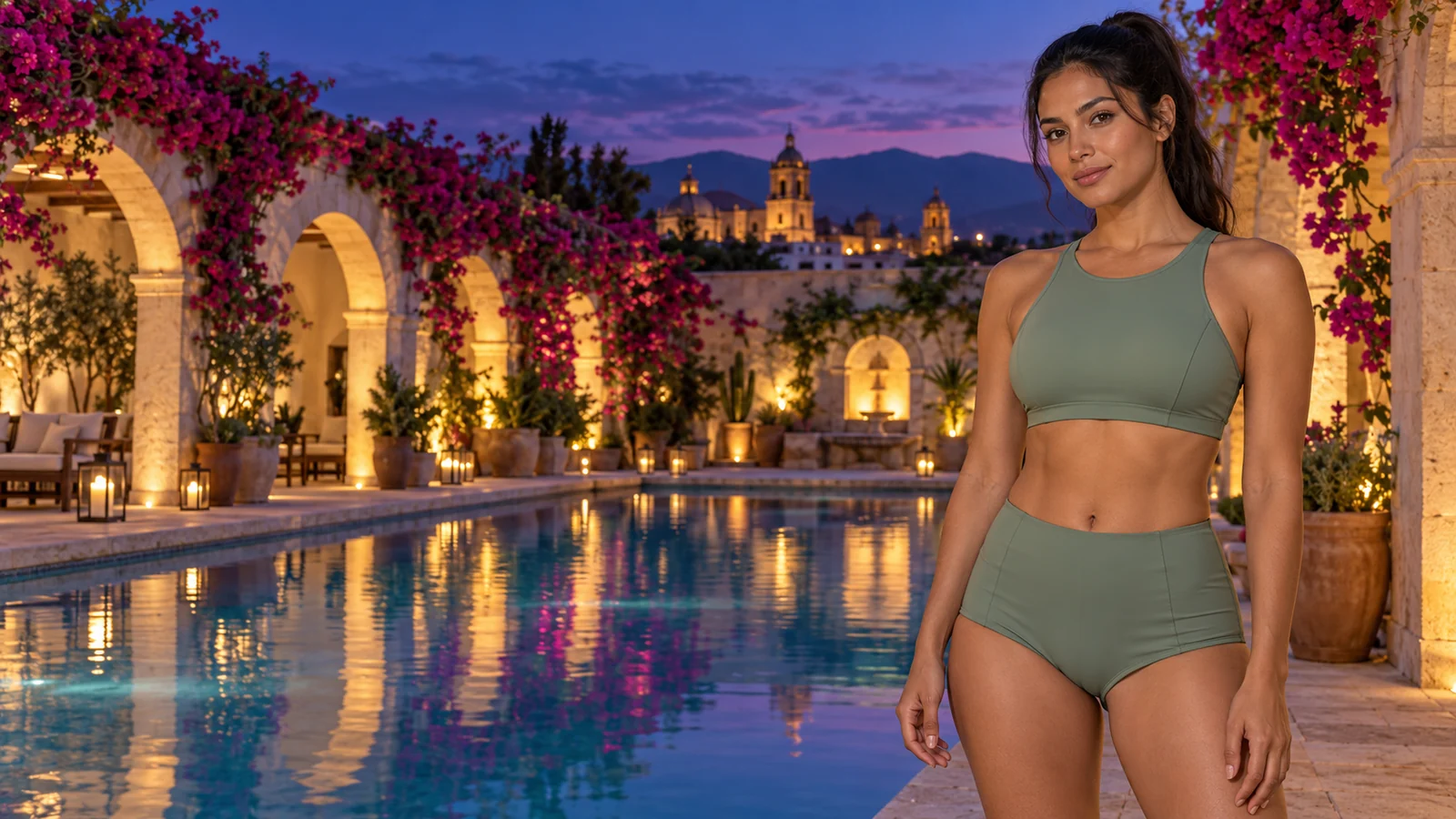
A close portrait gives expression the leading role. Keep the background simple enough that the eyes and the line of the face remain easy to read. Before choosing a frame, preview it as a small square. If the crop cuts into an important gesture or leaves the face lost in shadow, another composition may communicate more clearly.
This is a useful format for a profile tile or a small article card. It is less useful when the setting carries essential information. A portrait can be beautifully lit and still tell too little about the place or activity a feature is meant to describe.
A wider photograph gives the location a voice. In our sunset illustration, the horizon and evening light carry part of the mood. Removing that surrounding space would create a different image, even if the subject remained unchanged. The useful detail is the relationship between figure and setting.
For a cover with an overlaid title, leave a quieter area for the words. A detailed skyline directly behind the headline can compete with the copy. Test the crop with the real title rather than judging the empty image in isolation.
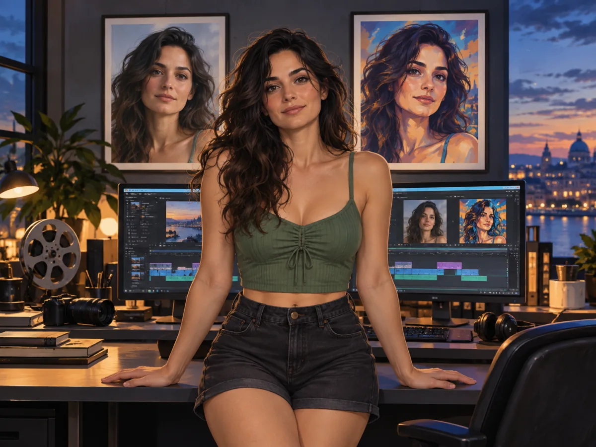
A detail can introduce texture, a working process or a change of pace. A photograph of an editing desk tells a different story from another full length portrait. Use that difference deliberately in an image sequence, so the next picture adds information rather than repeating the same impression.
Check whether the detail still makes sense without the surrounding frame. An isolated object can become ambiguous. A short caption can explain its role, but it should not have to rescue a crop that has removed the subject of the image.
A good fit has dimensions.
The output desk
Match the image to the space before polishing the atmosphere.
| Format | Example use | What to inspect |
|---|---|---|
| 1:1 square | A compact card or profile tile | Whether the face and gesture survive the crop |
| 4:5 vertical | A portrait feature | Space above the head and around the hands |
| 3:2 landscape | An article illustration | The balance between subject and surroundings |
| 16:9 wide | A banner or cover | Whether a narrow mobile crop loses the main subject |
Aspect ratio describes the shape, not the amount of detail. A wide image with few pixels may become soft when stretched across a large display. A larger file with the same proportions can provide more room for cropping, although file dimensions alone do not prove that the original detail is convincing.
Keep a clean master and export a version for its destination. Repeatedly saving a compressed copy can make fine transitions harder to assess. For a web layout, preview both a large screen and a narrow phone: the same image may need a different crop to keep the subject visible.
Captions should describe what readers are seeing. If a scene is invented, identify it as an illustration. If it is a demonstration from a service, that is a different claim and needs its own documented context. The archive imagery on these pages illustrates visual composition; it does not demonstrate a linked product.
Let the layout finish the thought.
From portrait to page
A dramatic image can become difficult to read when every surrounding element is equally loud. Pair an expressive cover with a quieter text area. Use a closer image later in the story to change pace instead of adding another large banner with the same visual job.
Think about the direction of attention. A subject looking towards the text can make an adjacent paragraph feel connected to the picture. A subject facing towards the edge of the page creates a different tension. These are composition choices, not a reason to claim that one service produces superior images.
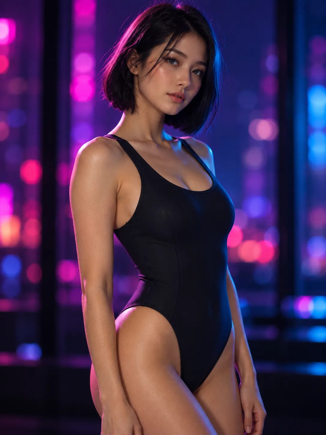
Our neon portrait uses colour as an accent, while the beach scene gives the page a wider setting. Mixing those roles creates variety without requiring unrelated imagery. A small portrait beside a service reference should remain an illustration, rather than appearing to be evidence of that service's output.
For a worked comparison of image roles and service descriptions, open the image service field guide. The About page explains this edition's scope. Return to the Shogun / Edit dispatch to view the examples together.